Nikon Lenswear Global Design
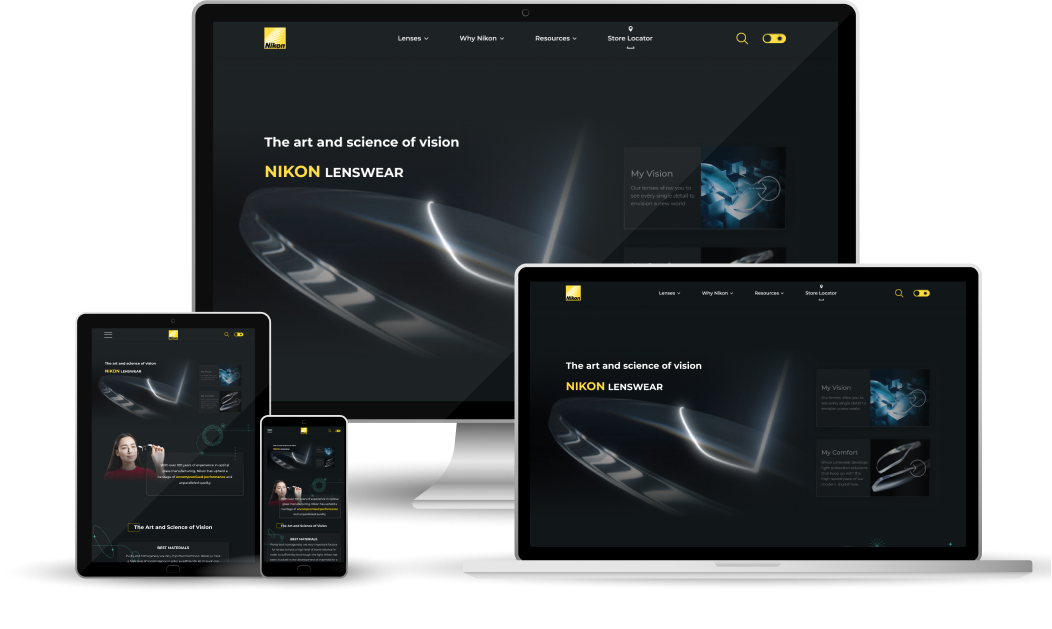
The Nikon Lenswear Global website design showcases a modern and user-friendly interface that highlights the innovative features of Nikon's eye lenses. The layout is clean and visually appealing, with a focus on high-quality imagery that captures the essence of the products.

objective
Nikon needed a digital platform that would showcase the quality and innovation of its eye lenses while aligning seamlessly with its global brand identity. The challenge was to create a user-friendly, visually appealing website that would effectively communicate Nikon’s commitment to high-quality eye care, enhance brand recognition, and engage users with an intuitive browsing experience.
typography and color palette
Typography
The website uses Montserrat as the primary typeface, chosen for its clean and modern appearance. It ensures excellent readability and complements the visual identity of the brand. The following font weights are used strategically throughout the design:
- Medium: For standard text elements, ensuring a clear and readable foundation.
- SemiBold: Used to highlight key information, maintaining a balance between emphasis and subtlety.
- Bold: Applied to headings and calls to action, capturing attention and guiding users seamlessly through the website.

Color Palette
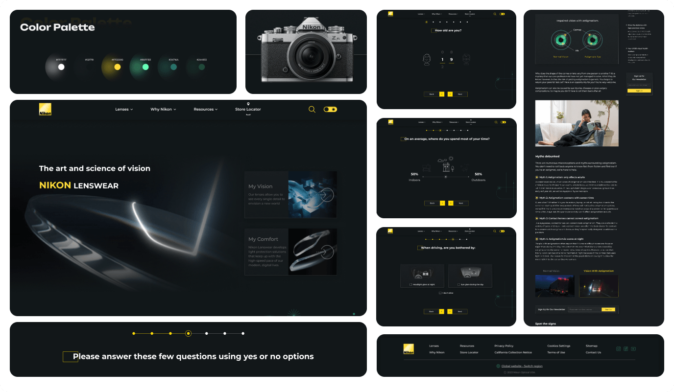
The color palette for the Nikon Eye Lenses Global website is carefully chosen to reflect the brand's identity, using shades that evoke trust, professionalism, and innovation. Interactive elements, such as hover effects and smooth transitions, enhance the user experience, making browsing the website engaging and enjoyable. Each color plays a key role in creating a cohesive, modern, and brand-aligned design.
- Yellow - HEX: #FFDD00
This bright yellow aligns with Nikon's iconic logo, reinforcing brand recognition and ensuring visual consistency across all digital and physical touchpoints. It creates an energetic and welcoming tone, complementing the brand's focus on clarity and precision. - Mint Green - HEX: #80FFB3
This fresh, vibrant mint green symbolizes innovation, growth, and a sense of renewal. It adds a modern feel to the website, creating balance with the energetic yellow, while enhancing the visual appeal without overwhelming the user experience. - Teal - HEX: #43978D
The teal conveys calmness, trust, and professionalism. As a transitional color between warm and cool tones, it helps the website maintain an inviting yet composed atmosphere, aligning with the brand's focus on high-quality eye care products. - Forest Green - HEX: #244933
This deep green tone provides stability and harmony, grounding the design and adding a natural feel to the palette. It represents health and wellness, reinforcing the importance of clear, healthy vision. - Charcoal Black - HEX: #121719 The dark, near-black shade introduces elegance and sophistication. It serves as a neutral background to make the brighter colors stand out while creating a sense of depth, enhancing readability, and maintaining a professional aesthetic.

Website Pages
The main page captures attention with a stunning hero image and provides a clear, concise introduction to the benefits of Nikon eye lenses. Easy navigation allows visitors to seamlessly move between key pages, including the Product Pages for detailed specifications, the Blog Page for expert insights and eye care tips, and the Homepage for a quick overview. Each section is thoughtfully organized to enhance the user experience, guiding users to find relevant information effortlessly.

Conclusion
The Nikon Lenswear Global design exemplifies a seamless blend of modern design, usability, and brand alignment. With a clean and visually appealing layout, the interface emphasizes Nikon's innovative lens technologies while ensuring a user-friendly experience. The strategic use of high-quality imagery, intuitive navigation, and concise content enables visitors to explore product specifications, customer testimonials, and educational resources with ease.
The carefully chosen color palette not only reflects Nikon's brand identity but also evokes trust, professionalism, and innovation. Each shade plays a unique role in balancing energy with calmness, stability with modernity, ensuring an engaging yet composed browsing experience.
Together, these elements—complemented by smooth transitions and interactive effects—result in a polished, engaging, and professional digital presence for Nikon Lens
wear. This project reflects not only our commitment to design excellence but also our ability to deliver a cohesive user experience that aligns perfectly with the client's brand values.


